Tutorial:Unit Card Guide
Why
Hello, my name is Cataph and I am a cardoholic.
I heard you made a new unit in TWWarhammer and you need a new flashy unit card. Simple. No, it ain’t. Unit cards are probably the unit’s component you will be staring at for the majority of the time, even more than the actual variant. Get it wrong and it can be an eyesore for the entire campaign and battle.
A good unit card will:
- blend in with other vanilla pieces
- show the unit’s appearance
- display, possibly, its character and gear and role
What
But first things first. A unit card is a 60×130 PNG. Don’t make it larger than that or it will automatically be compressed in-game and lose more quality than if you did it yourself. Its location is ui/units/icons, and it’s a good idea to open the data.pack and extract that folder for future reference. Its name needs to be the same in the card column in the unit_variants table.
In units/info you may find a version with a larger “shredded frame”, this is however only used in loading screens, so ignore that unless you need those for promo or stuff like that. Of course, if you do need one, start with that larger size and halve the size later for the actual unit card, or it will look like something you don’t want to look at.
How
You can use stuff like GIMP or Photoshop to assemble a unit card. Personally I use the latter so I will use its lingo, and I’ll have to assume you already know how to play around with it a bit. Specifically, you’ll want to know how to use layers and possibly adjustment levels. If you don’t, it’s fine, there are a lot of basic guides on the interwebs, and even if you skip some of the speshul effects I may end up using you’ll still get a better result than just plopping a screenshot in there.
Admittedly, during the transition between Rome2’s and Warhammer’s art style I made truly horrendous cards myself, but with time I noticed things and developed some tricks. Keep patience.
Most CA cards are similar to existing GW artwork, but are still made by a proper artist. I am certainly not one, but you’ll want to respect these factors:
- Positioning of the portrayed unit: not too zoomed in, not too far away; varies with races too. E.g., notice how Empire cards tend to have a western knee-cut, Dwarfs a full body.
- Lighting: CA cards are generally good luminosity, low contrast but with drawn highlights. This is important, you don’t want your card to be a confused blob.
Before we get to the chase, get this template! Always periodically test with the card frame on top, I used to get immensely pissed off when important details of my card got hidden by the UI. You will never see the entire card in the game, especially on ranged units due to the additional ammo bar. Remember to hide the frame again when you’re done. It’s a PSD file, but should work just fine in GIMP too. Oh, also try to avoid the area occupied by the XP chevrons.
The Three Jedi Ways
[please don’t use the sampled pictures without permission]
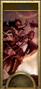
- THE ARTWORK. You grab a legal* and beautiful artwork around, and tweak it until it fits and shines. Usually the quickest method, but it requires a good sample. Example below, for my Skullreapers, based on this artwork.

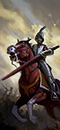
- THE MONTAGE. Even Rocky had a montage. You grab parts from existing CA cards and glue them together. This may look simple but it’s actually an excellent way to get god-awful cards, because each bloke in a card may have its size, positioning and lighting, and mixing them may not work like you’d think. You don’t want your card to look like the portrait of the Frankenstein’s Monster, or too samey with the neighbouring unit. Also, avoid recycling the same base too many times in the same roster or you’ll get this effect. Working examples: below for my Estalian Lancers, or this infopic by not-a-spoon.

- THE PHOTOSHOOT. You take things in your hands and start taking screenshots of the unit in-game. This can be a lengthy process, especially for cavalry and ranged units, but can be quite satisfying and produce a faithful portrait of the unit. It’s my favourite and most used method, and the one I’m going to describe. This is also where Positioning and Lighting really come to play.
* Remember that you can’t use non-WHFB stuff and if fan-art, you want to check/ask permission.
Guide to the Photoshoot
First off you need to take a good screenshot in which the unit comes with a good pose, possibly no animation glitches and clipping. As said, you need something that will fit in a 60×130, so some photography experience may come in handy.
Here are two examples that can give you an idea of how to crop and photoshop a battle screenshot and what the final result can potentially look like.


These two blokes are Estalian reskins for Swordsmen and Spearmen. As you can see, the pose needs to fit in a quite longilineal frame, so not all stances will work and also why cavalry is more difficult. You want to show at least part of the body and weaponry. If they have a shield, avoid it occupying too much of the card.
If you want to have an idea, while in-game, of whether something can fit in a card, put thumb and index of both hands in an L shape, indexes pointing up and thumbs completely overlapping with one another. This will make a |_| shaped frame for you that has similar proportions to the card. Now point it at the screen like a weird photographer, possibly while someone else can see and think you're a weirdo.

Protip! Use a better camera mod and the >N< key high-detail camera for better screenshots.
Usually you will want a decent lighting, so no early dawn or cloudy battles. You can still make those work but it’s harder and generally a waste of time.
For these guys I wanted a sunny look instead of the gloomy Empire cards, so I edited the sky background. Consider using this Sunny Weather mod.
The beginning may be as simple as auto-tuning Luminosity and/or Tone to remove weird tints. Afterwards you want to reduce contrast (by a lot, even up to 100!) and probably still increase luminosity (otherwise they are likely going to look quite bleak in-game). Test in custom battle selection until it’s not a grey blob anymore.
Then comes the holistic and complicated part.
- Protagonism: the bloke must be instantly distinguishable from the background. Selecting them with lasso/magic wand and making them a separate layer is always a good idea. Afterwards you’ll probably further lighten or darken the background stuff. Blurring also works but I usually don’t like it, as it can look too fake. Giving it a minimalist oil paint touch can also help.
- Background: when you have extra time and experience in your hands, you may want to add smoke, happy clouds, grim clouds, that sort of thing, behind the protagonist’s layer. Screenshots can often produce rather flat backgrounds and that can be off-putting. You can grab a nice panorama or sky from an in-game battle screenie or even a random photo, resize and apply it with a layer mask that excludes the protagonist and probably the ground they’re standing on. Then tweak at will for opacity, blending and even tone. CA backgrounds are often some unnatural colour, so don't worry too much about that. The important thing is that the unit is not standing on a uniform background, or with too much ground (no more than half), or that it's a mostly green unit on a green background.
- Contours: aka shading, but it kind of depends on how heavy-handed we're going. This is the secret recipe and why we lowered contrast. We said CA cards are artworks, and they often have visible dark contours and shading to underline parts. Get a brush, normally with these settings: Soft Light mode, 2 pixel width, 20 to 50% hardness. Start with the black on the edges of the unit and on the stuff you want to be visible, like edges of armour, belts, substantial ripples on cloth or other details that got undermined by resizing to such a small scale. Normally, 100% opacity is way too heavy-handed, try between 50 and 80%. If even that is too heavy, also consider using 1 px width instead (especially if the subject is smaller or at a dangerously low contrast). On the same layer (or a different one if you're picky) and at the same time, you can do discreet highlights by switching to white.
If there are parts that are DESPERATE for heavy contouring, make another 30 to 60% opacity layer at Multiply and use a 1px brush for those. Use with care. Contours can make a huge difference between a flat icon and one that can blend in with vanilla ones. However, it's not going to save a subject that is a flat grey surface that ends up looking like a boulder with mascara.
Couple of examples (Swashbucklers from TEB and Teutogen Guard) without and with contour:

Note from future Cataph: please note that this are extremely old cards for me. Like I'll mention again, I've adapted methods and hopefully improved across the years. I'd never accept those Teutogen Guards now. The cards were already heavily-engineered, but you can still notice an improvement. If you can't quite see where the shading is, here’s what the Swashie’s contour layer looks like on a background and at 100% opacity:

However, I’m actually gradually moving towards thicker contours, with one layer at size-2 brush and another up to 4 or 5 (still soft light) for the thickest shadows and bright surfaces.

This was also one of my first experiments with moving limbs around and pasting weapons from another screenshot so they're better visible or get you cool poses. Also an example of how snow is horrible as footing/background since it's so flat. Here I could save it with some brushing, but it's one of those things that might want replacing with another background entirely.
One further example (Lothern Sea Rangers):

In any case, you will still check how the card looks in custom battle roster selection (where it’s the smallest) and in the following screens. Sometimes it will suck so hard that it’s back to the drawing board, but that’s ok. Another thing that you should look at in-game is whether the lighting is ok or if the picture gets burned tfo when the unit is selected.
You read through here so here’s a prize: my first and terrible unit card for WH1, versus the same unit in WH2:

Don't despair. Learn how to grab the right screenshots and how to improve on them. We all make the mistake of trying to put lipstick on a pig.
Small Guide to the Montage
AKA Recycling and You.
For whatever reason you decide not to go for the screenshot method, and it's particularly understandable for stuff like cavalry or monsters that cooperate harder. I'll use the example of a Knights Encarmine card that I chose to redo recently at the time of writing this, and I chose to base it off the Knights of the Black Rose cause I wanted them to have a horse rampant.
This is the method I use sparingly, so hey, it was practice.

Respectively the vanilla card, and mine. Now, I mirrored the Black Rose dudes to begin with, they'd normally be facing right. Never make things too easy to recognize and this is easy.
Now, what did I do? Obviously, I needed to repaint the armour in red, so in this case I brushed red on the plate areas and used a combination of Overlay and Darken layers to make it right. Also some slight gold trimming that ended up looking best in Exclusion mode, but as usual tinker with layer modes for whatever works best.
Since I'm absolutely crap at manually painting new objects, I replaced the helmet and the horse's chamfron by pasting them from a screenshot. Make sure you take them in a way they're compatible with their position and rotation in the card to limit headaches there. The more you tinker with them the more definition you're going to lose.
Then I tweaked them and the rest in terms of hue, brightness and some slight shading.

This is all the edits I ended up doing on top of the vanilla card, with various methods of applying them, but you get the idea. Now, the card is obviously not perfect, it ended up being too crowded with feathers, and the second sword isn't too visible due to that, but whatever.
All in all, the montage can be a profitable way to save time, especially when you absolutely can't get good screenshots, but you can't use them for everything. As already joked before, you can end up with very samey cards and that's horrible. You should, for example, take care not basing your card on a unit's that is already available to your faction. In this case, it wasn't a problem because my factions will never access Knights of the Black Rose outside of allied outposts, but I wouldn't pull this trick again on the same base. And don't think you can get away with just mirroring the card again.

Yeah, don't do that. That's awful.
Much less recently, as another example, I also used a similar method for the Sea Patrol's Roc Riders, basing them on the feral hawks or whatever they are, because getting good screenies of flying cavalry is horrible.

Changed colours, did some tinkering, replaced the entirety of the background. Yeah, that's some kind of archer I glued on top. Sue me.
APPENDIX: Character Icons
Characters want their portraits too, of course. Their cards are kept in ui/portraits/units/(designated culture) and are quite simpler to make. You follow the Photoshoot method, fix the tone, probably increase luminosity a bit, and bam, done.
What you really want to work on at this point is that you want to use that faction’s face-to-frame size ratio to make it look better next to the other heroes and lords. For example Empire characters tend to be more zoomed-out, whereas Vampires have a creepier and closer portrait (you can recognize a bloodsucker by their selfies). When you check in-game on the custom battle roster, try to see if your faction’s character cards are all more or less the same zoom and crop. It looks a bit shady when the eyeline on all of them makes a rollercoaster wave.
Notice that CA has moved on to make more artsy portrait for their LLs in particular. I can’t easily explain how to emulate that style because I don’t have yet a one-size-fits-all pattern.
Making that stuff actually work in campaign is done by following the binning guide.
APPENDIX: Unit 2d Portholes
Aka Minspec portholes. These are the 2d pictures used in the lower left corner when you disable the framerate-consuming 3d portholes. For units, you’ll find these in UI\units\minspec_portholes and are 164×164 PNG circular icons. Use this different template as a base, screenshot your unit so that you can crop an acceptable bust portrait from it and put it in the group. Move it around until it looks alright, and usually only minimal tweaks are necessary like autotune and autocontrast.
After that, you usually want to cut/mask away the background so that the portrait will be properly superimposed to a smoky background in-game. You can do it via lasso or magic wand and/or brush. Hair parts will always be trickier. Use the solid colour background I put in there as a reference to check for floaty bits, make sure you hide that when you’re done.
Note: minspec name needs to be the same as the main_unit.
APPENDIX: Character 2d Portholes
Aka just portholes. Ditto with the previous paragraph, but these are explicitly for your characters. You’ll find these in UI\portraits\portholes\whateverculture and in WH2 they are 193×193 PNG circular icons, yes, do notice that these are larger than the unit minspecs. Use this different template as a base. Same exact procedure otherwise.
In Warhammer3, these 2d portholes are rectangular 300x164 (get this template instead), made to show up in the agent recruitment pool as well. Sadly, this means that we cannot get away with keeping the screenshot's background anymore, so you have to remove it or mask it away. The good thing is that it's not a third porthole, the bad thing is that we have to redo all the WH2 ones.
Make sure the portrait doesn't touch the right border, or it will look bad in-game with an abrupt straight edge. Left is ok, top looks also nicer if you can't fit the dude before the border but it matters less.
Name the character porthole exactly the same you’ve called the character’s unit card, or the bin settings will not find one of the two. As a general recommendation, just call both the same way you’ve called the character art set, e.g. dude_01, dude_02, LL_dudette, which, unless you hate yourself, will also be how you called the character art set.
Remember to put the same bin in both folders (compare with vanilla or other mods).